- Mon Nov 23, 2015 7:08 pm
#64877
Trump retweeted a bogus graphic purporting to show the percentage of whites killed by blacks and other homicide data delineated by race. Almost every figure in the graphic is wrong, some of them dramatically so.
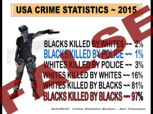
Trump’s Twitter account retweeted the graphic on Nov. 22 without any explanation. The image shows a man hidden behind a bandanna pointing a gun under the heading “USA Crime Statistics — 2015″ and next to statistics that purport to show homicides by race.
We’re not going to speculate about how originators of the graphic may have twisted data to come up with incorrect figures, or what intent may have been behind those errors — though others have.
We’ll just provide some correct figures according to the latest data available on all homicides from the Federal Bureau of Investigation’s Uniform Crime Reports data, for 2014. The 2015 data won’t be released publicly until the fall of 2016.
In cases when the race of the perpetrator and victim were known, among the 3,021 white victims of murder in 2014, 2,488 of them were killed by white offenders, and 446 were killed by black offenders. Among the 2,451 black murder victims in 2014, 187 of them were killed by white offenders, and 2,205 were killed by black offenders. Here’s how the percentages work out:
Blacks killed by whites: 7.6 percent.
Whites killed by whites: 82.4 percent.
Whites killed by blacks: 14.8 percent.
Blacks killed by blacks: 90 percent.
As those figures show, the graphic’s claims about “whites killed by blacks” and “whites killed by whites” aren’t just a little off — they are grossly inaccurate. The data from 2013 is nearly identical, so none of the 2014 figures is a one-year anomaly.
The 2015 data won’t be released publicly until the fall of 2016, a spokesman for the FBI’s Criminal Justice Information Services Division told us.
We reached out to the Trump campaign for backup for the figures cited in the graphic. The source listed on the graphic itself is “Crime Statistics Bureau — San Francisco,” a nonexistent agency, as far as we can tell. (Moskos said there is no such thing.) We also asked for the origin of the graphic. If we hear back, we’ll update this piece.